We loved the recent post on the blog Internet Dreams Realized about how to make sure your website is ready for smartphone interaction. We thought their five tips were spot on, so here we take a closer look at them, Websites 360®-style.

Is Your Website Mobile-Ready? Five Tips
1. Clean and simple
People visiting a website on a phone aren't usually web-surfing. They want something specific, and if they can't find it easily, they may get frustrated and abandon ship.
With Websites 360®, every website is responsive, which means it's built on a flexible grid layout that is scalable to the device someone's viewing it on. So when someone uses a phone to pull it up, they have access to every bit of content that they would on their desktop, as well.
However, it's all full-size for the device, and the content is presented in a straightforward, intuitive navigational style. People coming to your website will be able to instantly see their options, find what they're looking for and come away with a positive impression of your business.
2. Straight up
A vertical navigational structure is key since people will have to swipe and pinch and move the page around if a webpage runs off the sides.
Every Websites 360® site is built to stack on top of itself when being viewed on a smaller screen, and the navigation bar turns into a dropdown menu, so the user just taps to see the content section titles and scrolls to reveal the contents of the page.
3. Phone-specific features
At Websites 360®, mobile isn't just tolerated and dealt with. It's enjoyed. We love mobile over here, and we've designed your website so you can let mobile viewers do things they might not be able to on a desktop.
On Websites 360® websites, for instance, users can tap your phone number to call you. They can also tap a map you've linked to Google Maps and launch the app to immediately get directions to your place of business. This makes the user's experience more fun and gives you a direct return on their visit.
4. Tap, don't click
Websites 360® customers: you can check this one off your list. We've done the work for you, so every link on your website is actionable with the tap of a finger.
No confusing hover selecting (it's there...and then it's not) or tap-and-nothing-happens annoyances. Your website is built to be fully functional across devices.

5. Test it all
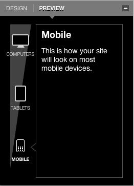
As you create your website, choose your colors and lay everything out, make sure to preview it in mobile view in your Websites 360® Design tool.
That way, you can confirm that it looks the way you'd like, that elements of the website show up the way you pictured them and check to see if there's anything you need to tweak to make sure your visitors have the best experience possible from their phones.
With Websites 360®, you're ready.
You're likely to see almost half of your traffic coming in from mobile devices. The good news is, you're ready. The ease of use and appealing design of your website on mobile will keep your visitors coming back not just to your web presence but to your business.
Originally published 9/10/12
