Featured Understanding White Space and its Role in Design.jpg

Understanding White Space and its Role in Design

White space — is it a waste of space or a valuable design tool? It really depends on who you ask.

A lot of website owners see it as the former — a missed opportunity for more images, videos or text that’s left empty for no real reason.

But, designers know differently. They know that white space can be an essential tool for creating an effective web design.

What, exactly, is white space?

Before we get into the details of the benefits of using white space for your website, it’s important that you know what it is.

To put it simply, white space — also called negative space — is the unmarked space in a design. This is the space between and around paragraphs, images, videos, etc.

White space also doesn’t have to be white; white space is still white space, no matter what color your background is. Even if you have a background image, the negative space is still considered white space.

5 reasons to incorporate white space into your website design

#1. It makes text more readable

Content is one of the most important aspects of your website — it is king, after all — and, it’s essential that when people visit your website, they are able to actually read it!

There are so many factors that can affect the readability of text online, including the weight and size of the font, the font style and the amount of color contrast that exists, just to name a few. There’s one more big thing that affects text readability, though — white space.

The right line spacing — in other words, the amount of space between each line in a paragraph — can have a drastic effect on the readability of text. Believe it or not, when you implement line spacing correctly, it can improve the readability of your content by as much as 20%!

#2. It can be used to emphasize elements on a page

When designing a page, chances are, you’ll want to draw the eye of your audience to a specific object, such as a section of content that gives an overview of your business or a call to action button.

There are many different ways that you could go about this, but the cleanest and, in many cases, the most effective way to highlight an element is by utilizing the white space around it.

By removing the other elements around the one you’re trying to highlight, you’ll make the existing element that remains stand out that much more. This ensures that your audience’s attention goes exactly where you want it to.

Determining exactly how much white space to put around an element can be tricky, but, the general rule is, the more white space there is surrounding an element, the more the element will stand out.

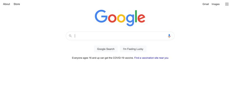
Google’s homepage is a great example of this. Without any clutter around it, the eye is immediately drawn to the search bar — which is exactly where they want the eye to be drawn.

whitespace1.png

#3. It helps organize your content

The proper use of white space can help you organize your website in an easy-to-understand, visually pleasing way.

Thanks to the law of proximity, the human eye will perceive a relationship between visual elements that are grouped closely together. In other words, when people see things arranged closely together, they appear to be related; whereas, things that are arranged with distance between them are perceived to be different.

With the amount of white space you use between elements, you can provide an organizational visual clue to your audience about the relationship between those elements.

The rule to use when organizing with white space is: less white space between elements will group them together, and more white space between elements will differentiate them.

One of the biggest benefits of white space as an organizational element is that it can replace divider lines. Divider lines certainly have their place in the organizational hierarchy, but, the big downside to using them is that they add visual weight to a page, making it appear clunkier.

With white space, you can accomplish the same kind of organization without all of that added weight.

#4. It adds a touch of luxury to a page

As you can see, there are a lot of practical reasons to utilize white space when designing your website, but, its usefulness goes far beyond the practical.

In fact, one of the biggest reasons to use white space is the aesthetic one — nothing can add luxury to a web page as much effective white-space use can!

The simple fact of the matter is that white space just looks a lot better than a site that’s cluttered with a lot of dividers and other elements. When there’s a lot going on on a page, there’s simply too much to look at for people to fully comprehend it, and it will leave your audience looking from one element to another.

White space makes a design more soothing to the eye, and it prevents your audience from getting overwhelmed by information.

The effective use of white space can make a web page look organized, clean and sleek. It’s no wonder why so many luxury brands utilize it so well. Apple, for example, does a beautiful job of utilizing white space on their website.

whitespace2.png

#5. It can help to increase conversions

Did you know that the average internet user doesn’t even have the attention span of a goldfish?

That’s right, your average goldfish’s attention span is seven to eight seconds; whereas, the average internet user’s attention span is about six seconds. That means that you need to be able to get your message across as quickly as possible or risk losing their attention and their business.

When you know how to use white space properly, you can use it to direct your audience’s attention to where you want it to go right away.

With white space, you can highlight your calls to action and direct your audience to them, which may help to increase your conversion rate.

Remember the importance of white space when building your own website

There are so many different elements that go into building a beautiful, effective website, and learning how to use white space effectively is just one of them. Whether you want to build your own website or you want to have someone build it for you, you’ve come to the right place. Get started.

Originally published 1/16/20