
As mobile phone and tablet usage continue to surge, so does the importance of having a mobile-friendly website. At the onset of our platform's development, we had two directions that we could have gone in to provide our customers with websites that worked across all devices.
The first option was to create a separate mobile website, in addition to the desktop version, for each customer website. This approach required having separate URLs and managing unique content for the mobile-specific website.
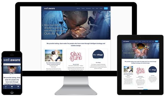
The second option was to leverage responsive design. Responsive design is an approach aimed at building sites that provide optimal viewing experiences across all types of devices. There is only one URL and one set of content to manage. A site designed with responsive design adapts the content to the screen size available by using fluid grids and images. Here’s a Websites 360® customer website showing a responsive design in action: