Web designers and developers have recently been digging deep into new approaches to serving images on responsive websites.
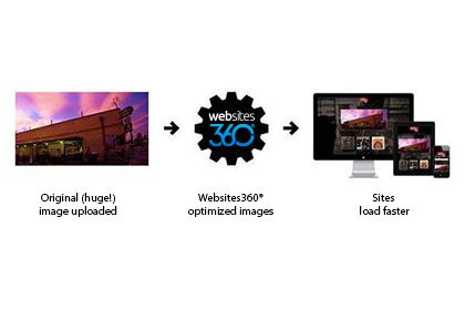
Image Optimization Tech Talk
Rob
Responsive design has become an essential part of any web dev's toolbox to help ensure that a single site can work beautifully across the full range of devices out there, but it raises some big questions, one of which is: when you're serving the same website to a giant 30" monitor attached to desktop computer as well as a tiny phone screen over a potentially-very-slow wireless connection, what's the right size image to serve to your user?
And if the answer is "multiple sizes," well, then... how should you do that?
Plenty of smart people have been looking into this and gathering lots of information about various approaches. Here at Websites 360®, we've been following the conversation closely and yesterday we launched and announced our own approach. If you're willing to put up with some nerd-speak, we'd love to tell you the basics of how it works!
We started by porting the open-source project Categorizr to node.js, the platform that powers Websites 360®. Like the original, our port is open-source and available on Github. Categorizr is a device-detection script that provides a pretty reliable answer as to whether a visitor is using a mobile handset, a tablet, or a desktop computer. When you first visit a Websites 360® customer site, we take note of that device type and store that detail in a cookie.
Our site templates make use of that device type to deliver a customized URL to any image that's used in the site's content. That URL includes a width value that's carefully determined based on the device type and the type of layout that's being applied to the content block that includes the image.
But when a browser requests one of those customized URLs, that's when the really cool stuff happens. If that particular image has never been served before, we use GraphicsMagick to crunch the original uploaded image down to the requested size and serve it directly to the browser, but we also cache it in Redis. This makes for extra-super-crazy-fast (that's a technical term) image serving on the sites that have the most traffic.
We had a lot of fun building this feature, but even more fun checking out the results.