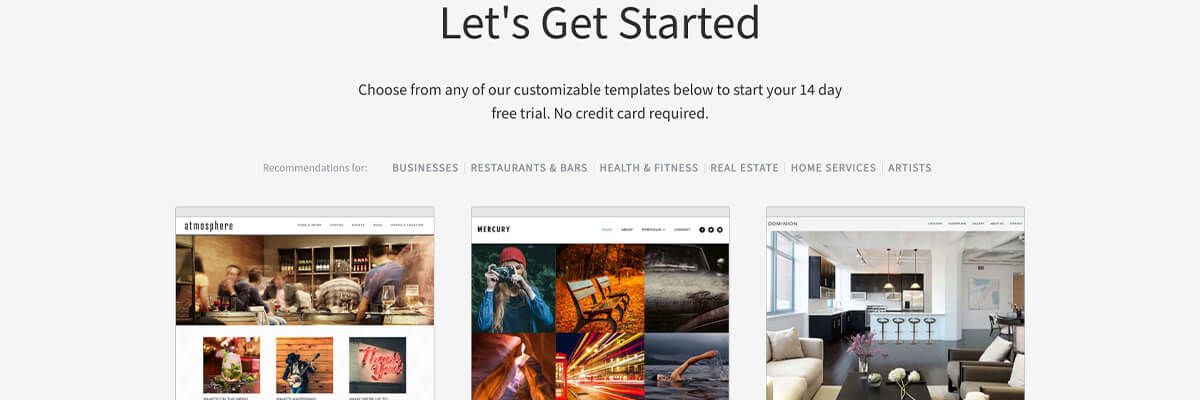
With the right design template and website builder, anyone can build their own business website, even if they don’t have a lot of previous design experience. But, that doesn’t mean that you should leave your design template as-is. Here are a few things you can do to maximize it.

How to Make the Most of Your Design Template
Robyn Rivera
5 Tips for Maximizing Your Website Design Template
#1. Choose a customizable template.
There are many different types of design templates you could choose from, but regardless of what template you choose, it’s imperative that it’s customizable.
While your website doesn’t need to reinvent the wheel or be completely out-of-the-box, it also shouldn’t look exactly like every other website in your industry. That means that you need to be able to customize any template you choose to reflect your brand and differentiate your business online.
When you choose the right design template, it gives you a fantastic jumping-off point, but when you can customize it, you can really make your website your own. That also means that you need to choose a website builder that’s easy enough to use so that you can effectively customize it on your own.
#2. Update the typography.
Website design templates come with standard typography, which is the font, color, and style of the text on your website. Typography is one of the many areas of your website that can, and should, represent your brand, but too often, businesses don’t bother to update it.
While the default typography on your average design template is perfectly fine, it isn’t representative of your brand. And, if you leave it as it, it’s also a missed opportunity to reinforce your branding, as well as your message.
You don’t have to choose the same typography for every area of your site, either. Choose a different color, font style, or font size to make headings, buttons, and calls to action stand out more. But, whatever typography you decide to go with on your website, make sure that it’s easy to read on any screen, desktop, laptop, or smartphone, especially when it comes to the bulk of your content. Any specialized fonts should be saved for headings and page titles.
Check out my previous blog to learn more about the ins and outs of website typography.
#3 Utilize beautiful, high-quality images.
The first thing people see when they visit your website is your images. If your images aren’t up to scratch, there’s a good chance that not many of your visitors will stick around for long. Just as the right image can grab the attention of your audience and spark the right kind of emotional response, the opposite is also true. The wrong images can send your visitors packing faster than almost anything else.
When choosing images for your website, always make sure that they look professional. That doesn’t necessarily mean that you have to hire a professional photographer — although, that’s certainly a good option if you have the budget for it. There are a lot of things that you can do to make even images you’ve taken on your smartphone look great.
You should also avoid cheesy stock photography. Stock photos can be a great option, but a bad stock photo can be spotted from a mile away, and it can hinder the effectiveness of your website.
If you’d like to learn more about how to choose the right images for your website, read my previous blog.
Once you choose the right images, you need to learn how to properly optimize them. This will help your website’s rankings in the organic search results, and it will keep your website lean, mean, and loading quickly.
#4. Customize the colors for your brand.
Don’t settle for the standard colors that come with the template you’re using. Not only do the colors on your website have an impact on how your site looks; they have an impact on how people feel about your website, as well as the decisions they make when they visit you online.
In addition to playing a role in purchasing decisions on your website, the colors you choose can, and should, be reflective of your brand. Color is so powerful that it can greatly increase recognition in your brand.
When choosing colors for your website, it’s important to know what kind of impact they can have on your visitors. Different colors evoke different emotions and different responses in people who visit your website.
Learn about the psychological impacts of different colors, as well as the role that color plays in the buying process, by reading my previous blog.
#5. Outsource the necessary elements.
With the right template and the right website builder, anyone can design a beautiful, professional-looking website by themselves, even without any design experience whatsoever. However, just because you’re doing it on your own, it doesn’t mean that you have to do it all on your own.
The great thing about designing your own website with Websites 360 is that you’ll have an easy-to-use website builder at your disposal, as well as a team of professional designers who are ready to help when you need it.
A lot of aspects of your website can be done on your own, but when you need a little extra help, don’t be afraid to get it! With Websites 360, you can get as much help or as little help as you need.
You don’t have to choose between a pricey, fully customized website and a DIY website template. When you have Websites 360 on your side, you can get the best of both worlds!
In order to make the most out of your design template, you first have to choose the right one! Get started today.
