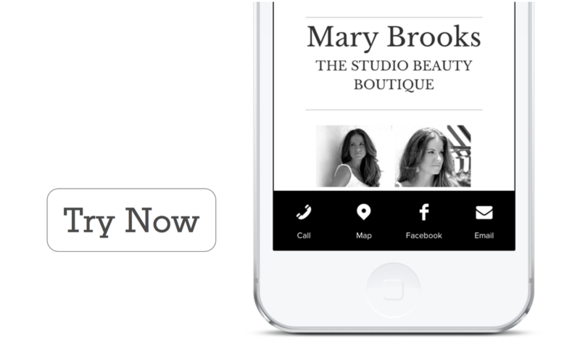
White iPhone with mobile footer navigation

Add a Mobile-Specific Footer for Easy Navigation

We stand by the assertion that responsive design is the most sustainable and user-friendly way to approach multi-device display of your website. Google, Bing, and many, many news sources and tech industry players agree. Per Google’s guidelines for developers:

“Google recommends webmasters follow the industry best practice of using responsive web design, namely serving the same HTML for all devices and using only CSS media queries to decide the rendering on each device.”

Oh, good, cause that’s what we do.

So if you have a Websites 360® website, you’re on target with Google and Bing’s recommendations (which is obviously good news for your SEO). But as the mobile web becomes more and more dominant, we continue to look for ways to follow Luke Wroblewski’s advice in his book Mobile First: “Be brutally efficient and trim, trim, trim.”

Mobile Settings

We wanted to give mobile users of any Websites 360® website exactly what they wanted in the easiest-to-access format possible.

So we created a way for you to add a mobile-specific footer with slick icons that enable intuitive navigation from a smartphone or tablet. This mobile footer highlights the most important content on your website to a mobile user, such as maps, contact information or reservations (for restaurants). It also offers the benefit of being available sitewide, so you don’t have to set up breadcrumbs or other janky internal links to keep users engaged.

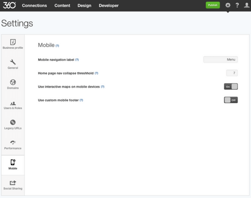
The all-new mobile footer is easy for anyone to implement on their website.* Ready? To get started, just click on the gear icon in your Websites 360® tool to go to Settings and then hit ‘Mobile.’

Use custom mobile footer for Websites 360® website

Here, you can customize a mobile-specific footer.

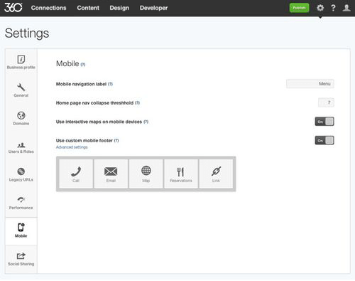
Once you've toggled the mobile footer to 'On,' we give you five options to add as content (though the maximum number of items you can add at once is four):

  • Call
  • Email
  • Map
  • Reservations
  • and Link.
List of available icons for mobile footer in Websites 360®

Choose from our gallery of icons to customize the style of the footer.

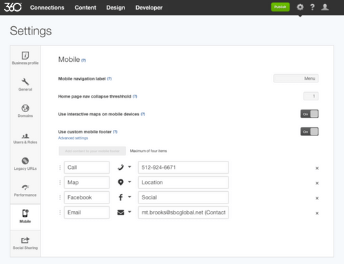
Custom mobile footer on responsive website

The 'Link' field allows you to feature any content on your website (such as your products page, blog, or photo gallery) or insert an external link (such as the URL to your ecommerce shop). Here, for the Mary Brooks Salon website, we've retitled a Link item 'Facebook,' selected the Facebook icon, and featured the Social page.

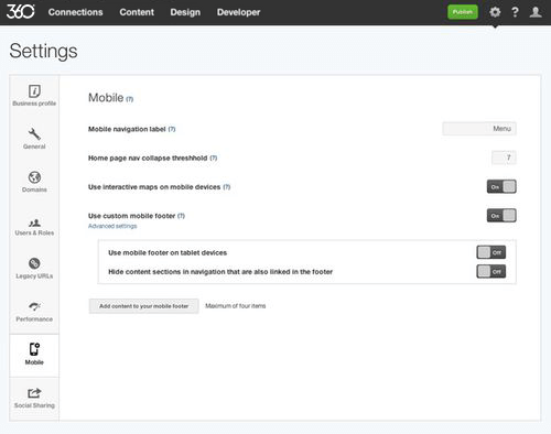
Advanced mobile settings for tablets and navigation items

Select ‘Advanced settings’ to turn the mobile footer on or off for tablets and hide content sections in the top navigation if you've also got them in the footer.

Websites 360® design panel - mobile footer settings

Next, style your mobile footer in the design panel.

To customize the look of your mobile footer, click into the Design tool. In the Sitewide side of your design panel, click 'Footer,' then 'Mobile footer.' Here you'll be able to

  • Choose the color of the text as well as the color & opacity of the background of the mobile footer
  • Specify icon-only or icon-and-text display (to show the icon labels you specified in Settings)
  • Select from four different icon styles and change the colors of the icons and shapes

Hand-picking all of these elements is a great way to extend your brand to a user's mobile experience. Your colors and stylistic elements should reflect the rest of your website while also standing out so

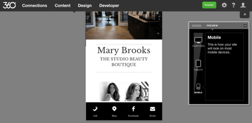
Once you've designed it to look the way you want it, go into Preview and click on 'Mobile' to see how it will look on a smartphone.

Mobile footer preview in Websites 360® tool

Beautiful, right?